Inspired EHRs: Designing for Clinicians
for Jeff Belden, MD at the University of Missouri, the National Institutes of Health, and California Health Care Foundation
Problem
Current electronic health records (EHRs) are characterized by clumsy interfaces, poorly designed information, and cumbersome workflows, all of which distance clinicians from quality patient care. In most cases, these systems are set up for failure —clinicians for burnout and, patients for health risks.
Solution
With a team of physicians, nurses, health IT, and HCI experts, GoInvo designed and co-authored an open source e-book to distribute ideas, designs, and techniques to health IT and EHR vendors to jumpstart EHR design on a national level.
Results
An open source, accessible, lightweight design policy for electronic health records.
Time: 1 designer and engineer over 18 months
Tags: Health IT & infrastructure, Open Source
Read the book View the code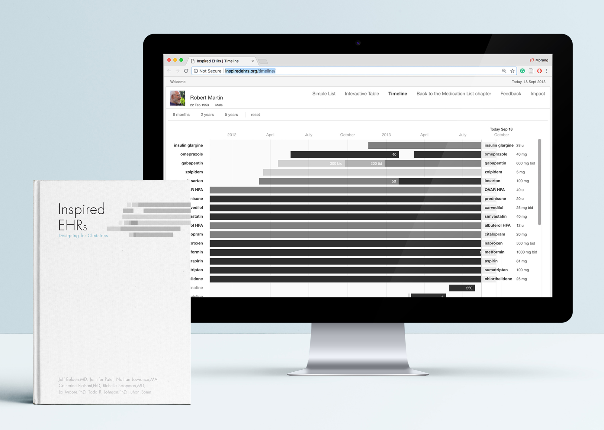
Background
EHRs (electronic health records) today are notorious for being difficult to use, though they play a critical role in providing health care across the United States. EHRs historically lacked intuitive interfaces, usable processes, and basic readability. As such, there’s plenty of room for improvement, informed by healthcare processes, human factors principles, and usability design. Jeff Belden, a family physician and professor at the University of Missouri, partnered with GoInvo to share this vision and inspire a change in EHR design standards. With support from the California Healthcare Foundation and the SHARP-C Project of the Office of the National Coordinator for Health IT, a team of physicians, humans factors and usability experts assembled to take on this challenge.
Process
With our years of EHR design chops, as members of the CCHIT Personal Health Record Workgroup in 2007-2008, HIMSS EHR Usability Taskforce 2009-2012, and leading the HIMSS Mobile Design Taskforce in 2011-2012, GoInvo provided software design expertise, usability and HCI guidelines, and design principles.
A web-based e-book as our canvas
Together, the core team approached the project knowing the outcome would be an interactive experience to communicate our vision to a niche audience. For our very first workshop, we brought in inspiration in the form of physical books, interactive digital experiences, and e-books. An e-book was a team favorite, with little creation costs and marketplaces already in place. As the project evolved, we saw that an HTML-based open source format would be our quickest, most accessible way to reach our target audience, and allowed us to prototype our designs as tangible examples. The e-book, exposing how software design and national standards collide, could be consumed as a lightweight design policy for electronic health records.

Workshops to explore and define core chapters and content
We facilitated workshops where the team, along with select physicians, nurses, and representatives from EHR vendors, explored and defined core aspects of EHRs, forming the foundation of the book's chapters. Hyper-focused breakout groups during these workshops further sculpted the chapters into key elements, issues, and potential solutions, which the team took away, exploring design concepts and supporting detail, honing into a cohesive vision for the future of EHR design.
Writing for designers and engineers
In addition to workshop facilitation, design, and prototyping, we also contributed to the content of the book. In addition to rounds of review with test readers, our team performed iterative rounds of editing of not just designs but also text. With selective word choice and tightening of text, the team was able to convey complex clinical situations to designers and engineers in clear, concise language.
Insights
Designs you can touch and play with
We designed and prototyped example components for an EHR modeled to support care provider workflows and aid decision-making, integrating them into chapters. The web-based nature of the e-book provided a seamless interactive experience for readers, giving them a taste of potential capabilities and context for clinical use, with supporting detail for how it would improve the care a clinician would provide.
Open source web format
We originally designed early versions of the e-book for Apple format, using iBooks Author to compose and iBooks to share and test the contents. As the project evolved, we saw that the web would be able to reach a much wider audience, no matter their device of choice, gave us greater control over content, updates, and allowed us to make the transition from e-book to prototyped examples as seamless as possible. We published the final product under the Apache 2.0 license.
Solution
Provider and patient-centered design
Because our core team was composed of physicians, nurses, and HCI experts, we could leverage their real-life experiences in our designs. We designed for, not only a provider’s thought processes, but also day-to-day tasks and workflows. By reducing cognitive overload and various interaction fatigues, we support patient safety and set the provider up to deliver the best care possible.
Focus on the patient
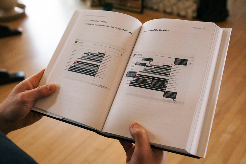
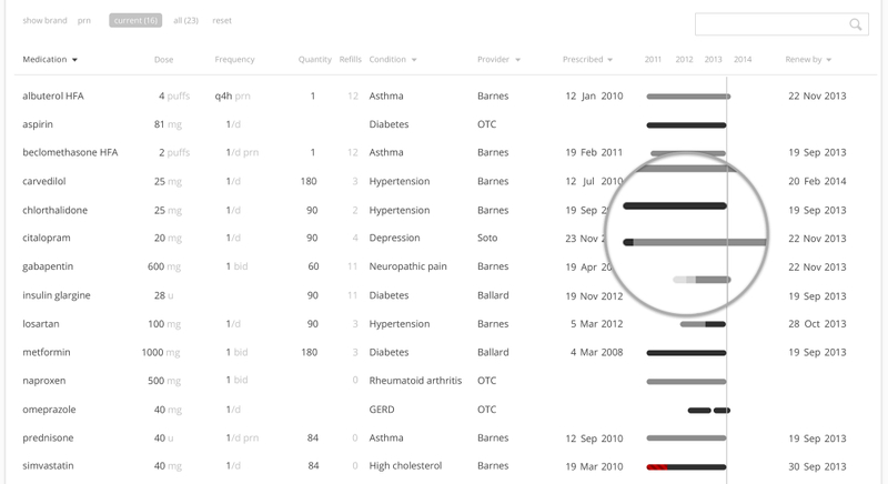
Typically, a physician may be seeing a patient for a small handful of specific needs, and it can be difficult to see the larger picture of the patient’s life. A person may have several care providers tending to different health concerns, and those providers don’t always have a clear idea of what another is doing or why, and patients don’t always know or think to tell their cardiologist what their dermatologist is doing and vice versa. We designed our medication timeline to be easily scanned and provide “situational awareness” to any provider, as well as to quickly reorder the list to the medications they care most about. Miniature displays of the medication timeline give providers a quickly scanned visual reference to understand how long a patient has been taking a medication and changes in the prescribed therapy over a recent time period.
Patient history as a blueprint for providing care today
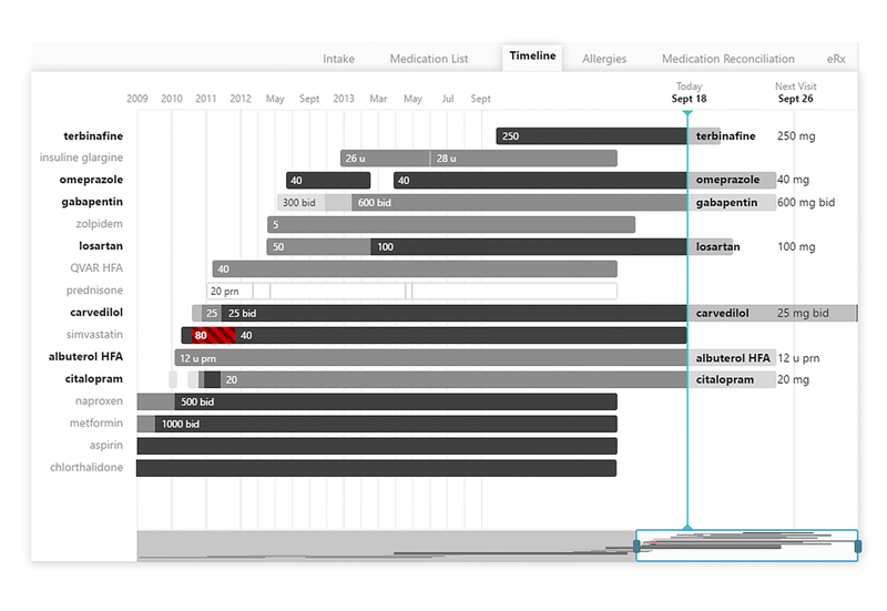
The medication timeline allows a provider to view medication history in greater detail, telling the story of our patient’s medical history. By looking at the past, a provider gets a picture of how certain conditions evolved over time, when treatments changed, what therapies worked, what didn’t, and why. The timeline is meant to quickly communicate dose strength with the use of shade, where lighter values are a smaller dose, and the darker values are a larger dose, and red with striping indicates when a prescribed dose is beyond the recommended maximum. The timeline is navigable and zoomable to provide deeper detail, with future concepts including notations, indicators for refill or renewal, and medication adherence.
A fast and intuitive e-book
We designed and engineered the e-book to be easily navigable within and between chapters. Readers could skip or dig into unobtrusive tidbits we dubbed “sidebars” or refer to other chapters where we go into deeper detail on a topic without losing their place. Though we load in a number of images into each chapter, page loads wouldn’t hamper readers, and images could be blown up to view more detail. The ebook can be accessed from desktop, laptop, tablet, or your phone and is designed to be simple and lightweight for your pocket and your brain.
Inspiring designers and engineers to push the boundaries
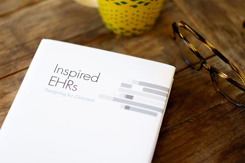
Inspired EHRs: Designing for Clinicians offers inspiration and design principles to aim for EHRs designed with the clinician and patient in mind. We’ve used a lot of the research and designs in our own work at GoInvo and are always happy to hear from others in the industry how the e-book has helped their designs or organizations.
Your human factors and design principle sections has convinced a lot of my bosses to go in a new direction with design.
Xue Lee
Marshfield Clinic User Experience Designer
