Where Your Health Dollars Go
To Understand the Healthcare system, follow the money
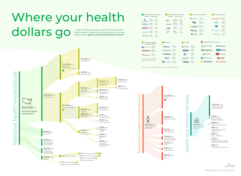
"Where your Health Dollars Go" is a map of the US healthcare system and its components. By following the allocation and flow of money in healthcare, the thread of how the organizations, departments, and major players are connected becomes apparent.
The visualization serves two purposes. The first is to provide the public and professionals interested in the healthcare space a way to increase understanding and explore how all the pieces fit together. The second is to give providers, patient advocacy groups, health policymakers, and health economists a visual communication tool to discuss issues at the higher health systems level.
*Tax exclusion $ amount is not added into the $3,500B national health expenditure. Though it is a part of expenditure, it is not included in many data sources and is unclear how it should be best organized without causing contradictions in the expenditure breakdowns.
*$168B in research is a higher $ amount than the category breakdowns within it, as the $ amounts are taken from sources from differing years.
*All $ amounts have been rounded to the nearest billionth for readability and scanning purposes.
The US healthcare system is extremely convoluted. To call it “spaghetti” would be an understatement. Because of the complexity, accurately capturing and following associative and financial relationships is difficult. The wider picture of how organizations are connected, how money flows through the US healthcare system is difficult to see. As a result, public discourse around US healthcare issues and reforms are often too narrow in context. Many consumer services and products developed in the health technology space don’t consider long term, primary, secondary or tertiary, downstream effects they will have on the market or for patients in this wider view.
"Where your Health Dollars Go" provides a detailed high-level view of major components within the US healthcare system and how they interact. The map serves as a communication tool for health professionals, organizations, groups, and policymakers to develop services and policies with the context of the larger picture of how their plans may impact the nation from the government to individual patients. The visualization also provides a canvas for professionals to use, projecting their services and products on the map, to more effectively drive development that aligns with our patient health values.
We’d love your feedback
The current draft of the visualization maps some of the major players. However, there are many parts of the system that have yet to be incorporated, and there may yet be improved ways to represent those relationships than the approach taken here.
Send feedback on this draft to hello@goinvo.com, and help us, as well as others, gain a better understanding of the often convoluted, and complex, system that is our healthcare.
Subscribe to our newsletter
You'll receive our latest ideas, visualizations, and studio news delivered to your inbox twice a month.
Methodology
Below is a description of the methodology used in creating the "Where your Health Dollars Go" visualization. It is updated based on continuing research and feedback.
v1 - 30.Jan.2019
The components of the healthcare system to include in the visualization were primarily based on what public data was available. Some expenditures were based on older estimates due to difficulty in finding up to date data (such as administrative costs for private health insurance).
Other expenditures, such as numbers on fraud, waste, and abuse for health insurance programs, are best guesses based on a range of estimates as referenced below.
Column 1, National health expenditure section
- $3,500B, 2017 National Health Expenditure1
Column 2, National health expenditure section
- $2,600B, 2017 National health insurance1
- $366B, 2017 Out of pocket1
- $355B, 2017 Other third party payers and public health activity1
- $250B, 2017 Tax exclusion, employee health insurance subsidy2
- $168B, 2017 Research3
Column 3, National health expenditure section
- $1,200B, 2017 Private health insurance4
- $1,400B, 2017 Public health insurance1
- $103B, 2015 Private funds4
- $36B, 2017 Public funds4
- $5B, 2017 Nonprofit foundations4
Column 4, National health expenditure section
- $1,030.8B, 2017 Patient benefits5
- $3,500B, 2017 private health insurance expenditure1minus $169.2B 2017 estimated administrative costs in private health insurance.
- $169.2B, 2017 Administrative costs, private health insurance5
- $804.51B, 2017 Medicare expenditure6
- $582B, 2017 Medicaid expenditure7
- $133B, 2017 Other health insurance programs1
- $72B, 2015 Pharmaceutical private funds3
- $17B, 2015 Medical technology private funds3
- $6B, 2015 Biotechnology private funds3
- $7B, 2015 Other sectors3
Column 5, National health expenditure section
- $534.64B, 2018 Insurance claims & indemnities for Medicare6
- $203.73B, 2018 Grants, subsidies, contributions for Medicare6
- $66.13, 2018 Other expenses for Medicare6
- $71B, 2017 Administrative costs of Medicaid8
- 12.2% is mean administrative loss % for MCOs, multiplied by$582B 2017 Medicaid expenditure7
- $511B, 2017 Patient benefits from Medicaid8
- $45.8B, 2014 Fraud, waste, and abuse within Medicaid9
- $52.55B, 2017 TRICARE expenditure10
- $17.52B, 2017 CHIP expenditure11
- $62B, 2017 Other health insurance programs not listed here
Column 6, National health expenditure section
- $454.14B, 2018 Patient benefits for Medicare12
- $534.64B, Insurance claims & indemnities, minus$80.5B 2018 fraud, waste, and abuse12
- $80.5B, 2018 Fraud, waste, and abuse for Medicare12
Column 1, Personal health expenditure section
- $2,800B, 2016 Personal health expenditure13
Column 2, Personal health expenditure section
- $1,070B, 2016 Hospital, personal health expenditure13
- $658B, 2016 Physician and clinical, personal health expenditure13
- $325B, 2016 Prescription drugs, personal health expenditure13
- $160B, 2016 Nursing care facilities & continuing care, personal health expenditure13
- $123B, 2016 Dental, personal health expenditure13
- $375B, 2016 Other personal health expenditure13
Column 1, Health and human services expenditure
- $1,110B, 2018 Health and human services expenditure14
Column 2, Health and human services expenditure
- $1T, 2018 Centers for Medicare & Medicaid Services14
- $47B, 2018 Administration for children & families14
- $26B, 2018 National Institutes of Health14
- $6B, 2018 Centers for Disease Control & Prevention14
- $5B, 2018 Indian Health Service14
- $4B, 2018 Substance abuse and mental health services administration14
- $2B, 2018 Food and drug administration14
Author
References
- Historical - Centers for Medicare & Medicaid Services. (2018, December 11). Retrieved Jan 2019 (original source no longer available): https://www.cms.gov/research-statistics-data-and-systems/statistics-trends-and-reports/nationalhealthexpenddata/nationalhealthaccountshistorical.html
- The Hidden Subsidy That Helps Pay for Health Insurance. (2018, January 20). Retrieved Jan 2019: https://www.nytimes.com/2017/07/07/health/health-insurance-tax-deduction.html
- U.S. Investments in Medical and Health Research and Development. (n.d.). Retrieved Jan 2019. (archived link).: https://web.archive.org/web/20190105092417/https://www.researchamerica.org/sites/default/files/2016US_Invest_R&D_report.pdf
- US Census Bureau. (2018, September 12). Health Insurance Coverage in the United States: 2017. Retrieved Jan 2019: https://www.census.gov/library/publications/2018/demo/p60-264.html
- Administrative costs of health insurance schemes: Exploring the reasons for their variability. World Health Organization. (2010). Retrieved Jan 2019. (archived link).: https://web.archive.org/web/20190924164852/https://www.who.int/health_financing/documents/dp_e_10_08-admin_cost_hi.pdf
- Data Lab - Budget Function - U.S. Treasury. (n.d.). Retrieved Jan 2019: http://healthaffairs.org/healthpolicybriefs/brief_pdfs/healthpolicybrief_123.pdf
- CMS Fast Facts - Centers for Medicare & Medicaid Services. (2018, August 1). Retrieved Jan 2019. (archived link).: https://web.archive.org/web/20190101013028/https://www.cms.gov/research-statistics-data-and-systems/statistics-trends-and-reports/cms-fast-facts/index.html
- Medicaid risk-based managed care: analysis of administrative costs for 2016. Milliman. (2017). Retrieved Jan 2019. (archived link).: https://web.archive.org/web/20180219002149/http://www.milliman.com/uploadedFiles/insight/2017/MedicaidAdminReport-2016.pdf
- Office of Inspector General, Department of Health and Human Services. (n.d.). Management Challenge 2: Fighting Fraud, Waste, and Abuse in Medicare Parts A and B. Retrieved Jan 2019. (archived link).: https://web.archive.org/web/20190503220822/https://oig.hhs.gov/reports-and-publications/top-challenges/2015/challenge02.asp
- Annual Evaluation of the TRICARE Program. Fiscal Year 2018 report. (n.d.). Retrieved Jan 2019: https://www.health.mil/Military-Health-Topics/Access-Cost-Quality-and-Safety/Health-Care-Program-Evaluation/Annual-Evaluation-of-the-TRICARE-Program?type=Reports#RefFeed
- Total CHIP Spending (in millions). (2018, December 6). Retrieved Jan 2019: https://www.kff.org/medicaid/state-indicator/total-chip-spending/?currentTimeframe=0&sortModel=%7B%22colId%22:%22Location%22,%22sort%22:%22asc%22%7D
- The $272 billion swindle. (2014, May 31). Retrieved Jan 2019: https://www.economist.com/united-states/2014/05/31/the-272-billion-swindle
- Health, United States, 2017. US Department of Health and Human Services. (2017). Retrieved Jan 2019: https://www.cdc.gov/nchs/data/hus/hus17.pdf
- FY 2018 Budget in Brief - Overview Tables. (2017, May 23). Retrieved Jan 2019. (archived link).: https://web.archive.org/web/20190109122345/https://www.hhs.gov/about/budget/fy2018/budget-in-brief/overview-tables/index.html

