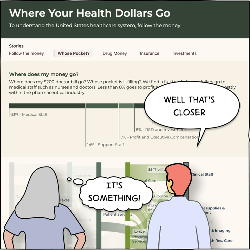
Where Your Health Dollars Go (redux)
To Understand the Healthcare system, follow the money
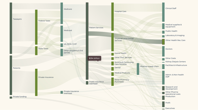
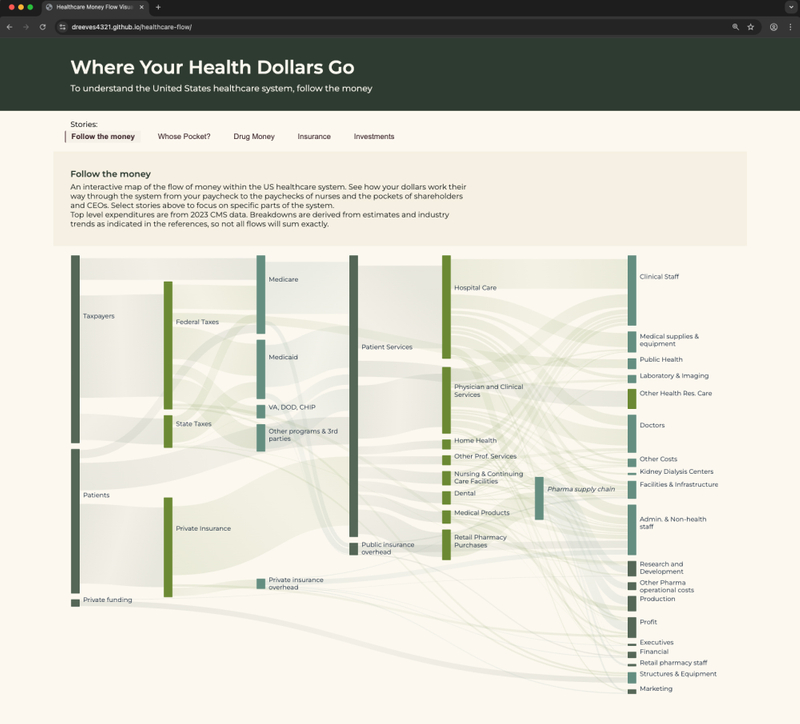
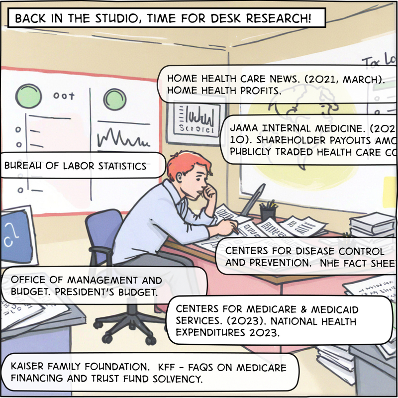
"Where your Health Dollars Go" is a map of the US healthcare system and its components. By following the allocation and flow of money in healthcare, the thread of how the organizations, departments, and major players are connected becomes apparent.
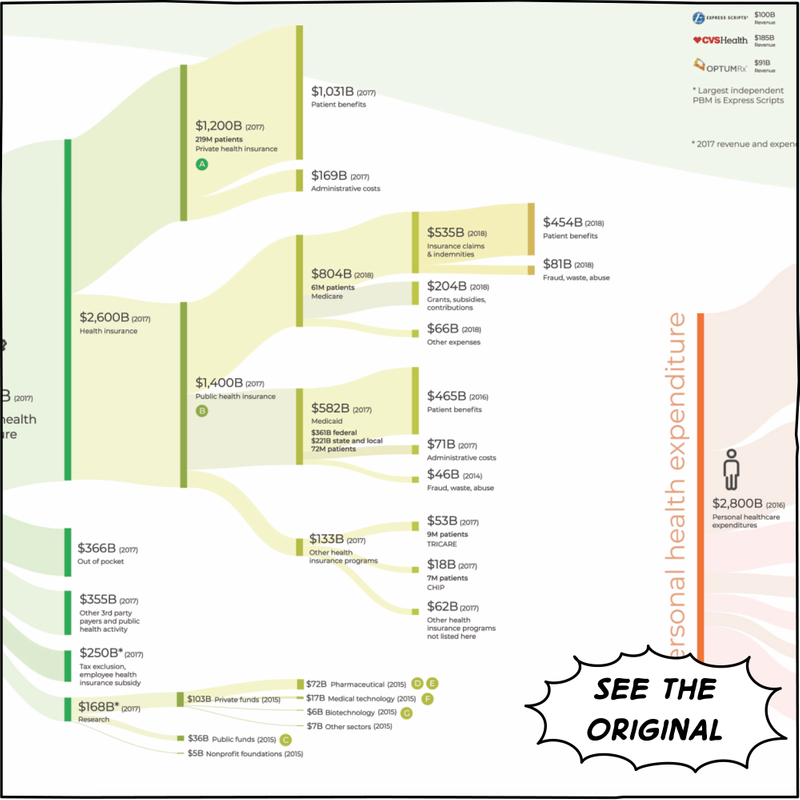
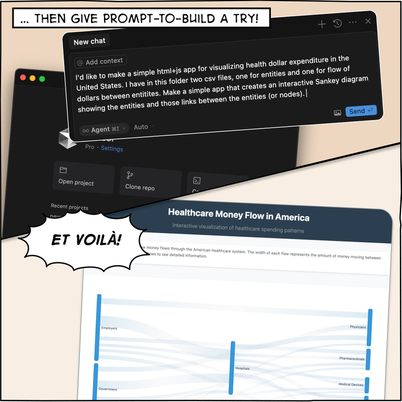
We expand on prior work and present an interactive map of the flow. Check it out and see how your dollars work their way through the system from your paycheck to the paychecks of nurses and the pockets of shareholders and CEOs. Select stories to focus on specific parts of the system.
The Process


Author

Subscribe to our newsletter
You'll receive our latest ideas, visualizations, and studio news delivered to your inbox twice a month.